Digital publication is about magazines and books that have been put onto smartphones and tablets and can be accessed anywhere. In our Digital Media we are more specifically looking into how magazine’s are transformed into digital versions.
The earliest version of digital magazines were on computers which would simply just turn the page and could link you to there website. They were usually free.
But now as they can be put onto smartphones and tablets, they have started to make them much more animated. For example; the National Geographic magazine, that me and my group looked at, showed the magazine with a black cover that was shrouded in fog and when the fog lifted it unveiled a dinosaur on the front cover.
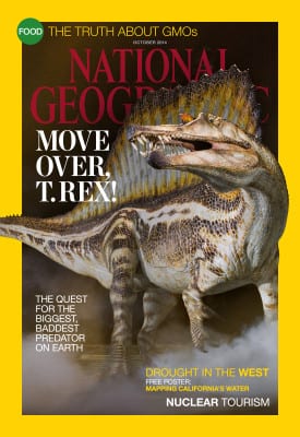
National Geographic front cover Oct 2014
Throughout the magazine, if you swiped it across, it would go to the next article but if you scrolled down the magazine it would go into more detail of the article and would be a more interactive to you.
Another digital magazine we looked into was WIRED Magazine. This digital magazine was much more interactive. When you look at the front cover the man at the front looks at you but when the sticky notes go on him, he starts to pull different faces.

WIRED Magazine oct 2014
It does not stop there, when you start to go through the different articles it can allows you to be interactive with little the image and buttons there are. For example; in the article (below) the image is completely interactive everyone in that image has a number on there head, if you press on that it expands and tells you more about that person and there experience when doing the article. In addition, the apps of the month on the right hand side are completely interactive. If you press the app picture it will take you to the app store and show you that app which you can then purchase. Then, the digital magazine would sometimes play a video or an advertisement or something that WIRED had created.
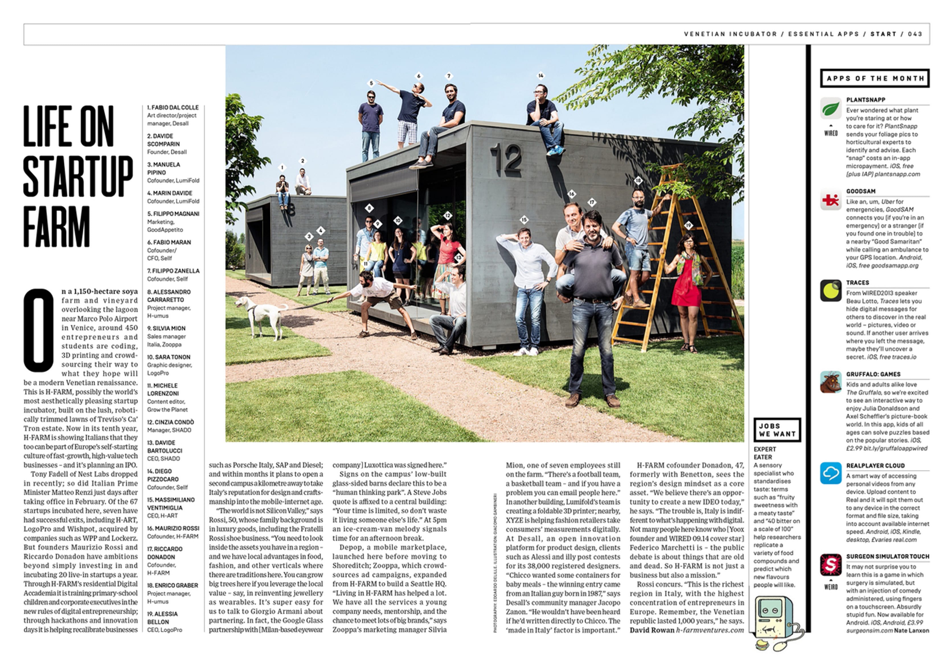
Inside WIRED Magazine (1)

Inside WIRED Magazine (2)
In the second magazine article (above) all the little icons were interactive. When you clicked the icon it would expand telling you more about it and again would lead to a link to another website or a video.
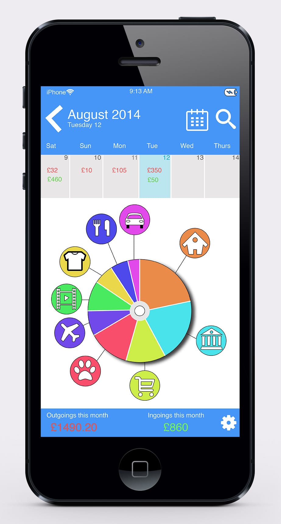
I found digital magazines very intriguing as I have never really looked into them before but I can see why they are quite popular as they are stored on your device. This means less luggage and they are also interactive, which would keep your readers entertained and intrigued in the magazine.