User Oriented Design – logo sketches and design

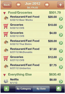
After I did my Research and Development I got right down to designing a logo. I wanted to create a very unique and colourful logo for my demographic group of people that would love, enjoy, recognise very easily and had its own personality.

I started looking at other personal budgeting websites and their logos to see what they have done and I wasn’t very impress to say the least. If you want people to use a product the logo should be very eye catching and say to the consumer what your business is.

you need a budget logo

you need a budget logo

You Need A Budget’s logo is a very basic and straight to the point. It says what it does straight away to the consumer who wants to use it, in addition it does look professional. My only problem with it is that I would have thought they would have done a little face to go along with the speech bubble.
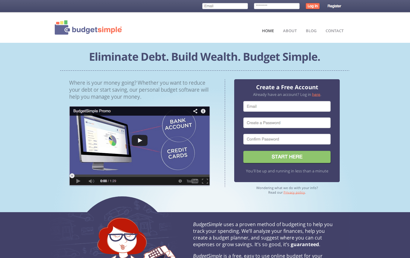
budget simple logo

budget simple logo

Budget Simple’s logo is very colourful and eye catching with the use of the red, yellow, green, blue and orange. I do, again, like how it gets straight to the point that it tells the person that you can budget simple and easily.

buxfer logo

buxfer logo

I do not really like Buxfer’s logo because by looking at it you are not able to see that it is a personal budgeting business. I also feel that this logo is not very eye catching like the other two above as it is not colourful and bold.


My logo designs for personal budgeting 

Overall, I am really happy with all of the logo’s that I designed as I think they are quite creative, imaginative and also get straight to the point.
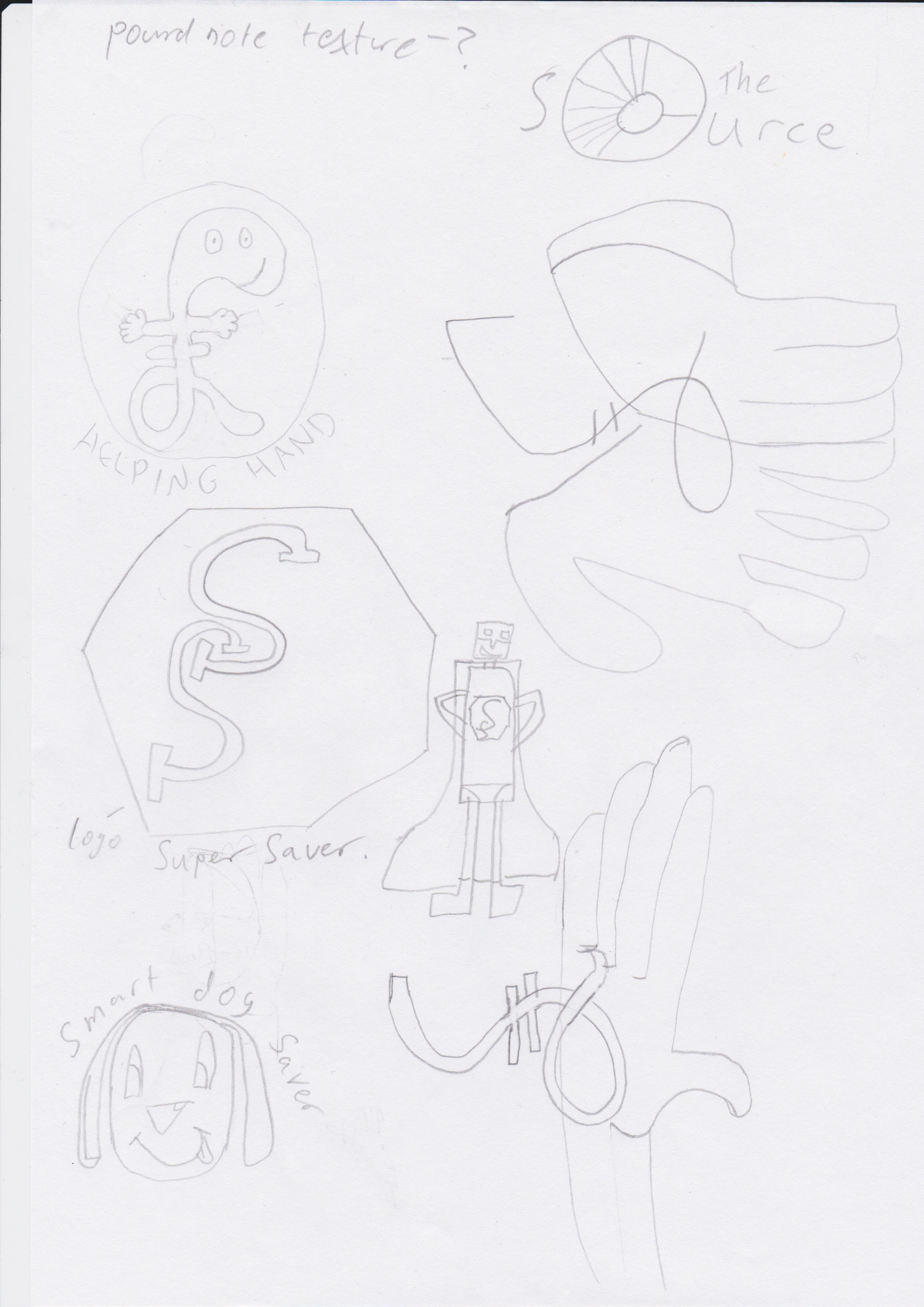
my designs

my designs


1st design

1st design logo

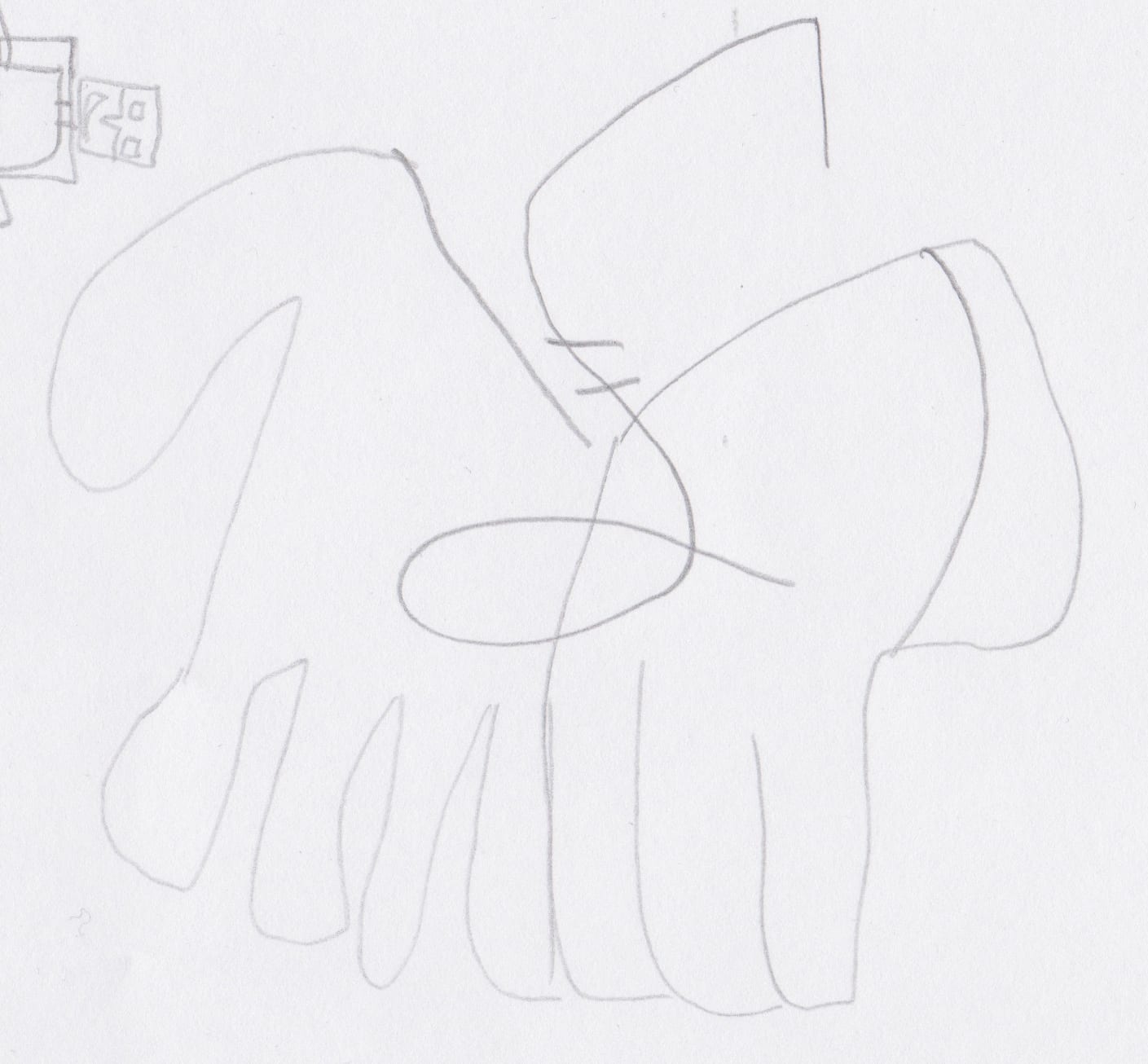
My first drawing I thought of was a hand giving out money or holding a pound sign almost like it wants to help you with your budgeting. However I did feel like some kind of design or idea like this had already been used and didn’t feel comfortable using this as my logo.

2nd design

2nd design logo

My second drawing I thought how about was two hands helping out to give help but yet again I did feel like before with my first design was that this idea had already been used and no one would pay attention to it.


3rd design logo

3rd design logo

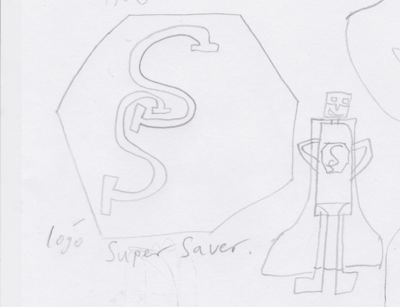
My third attempt was to think of something else other than hands and thought why not have a super hero that helps budgeting and so I created Mr Super Saver. I really like what I produced and how it looked, especially the logo as I was trying to think of something rememberable and would be iconic to that character. Even though i liked Mr Super Saver, personally I thought it would not appeal to the demographic of people I am targeting towards.

4 th design logo

4 th design logo

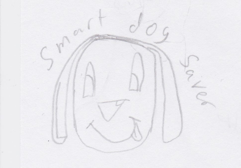
My fourth design idea was to created some kind of cute fluffy animal that would appeal to people to use, almost like the Compare the Meerkats and created Smart Dog Saver. Again, I personally liked the design I created and thought the dog was really cute and funny. However, I did think that it would attract the wrong kind of consumer, such as people who are interested in budgeting for pets and animals which is not really what I am targeting towards.
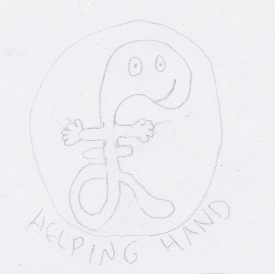
 

5 th design logo

5 th design logo

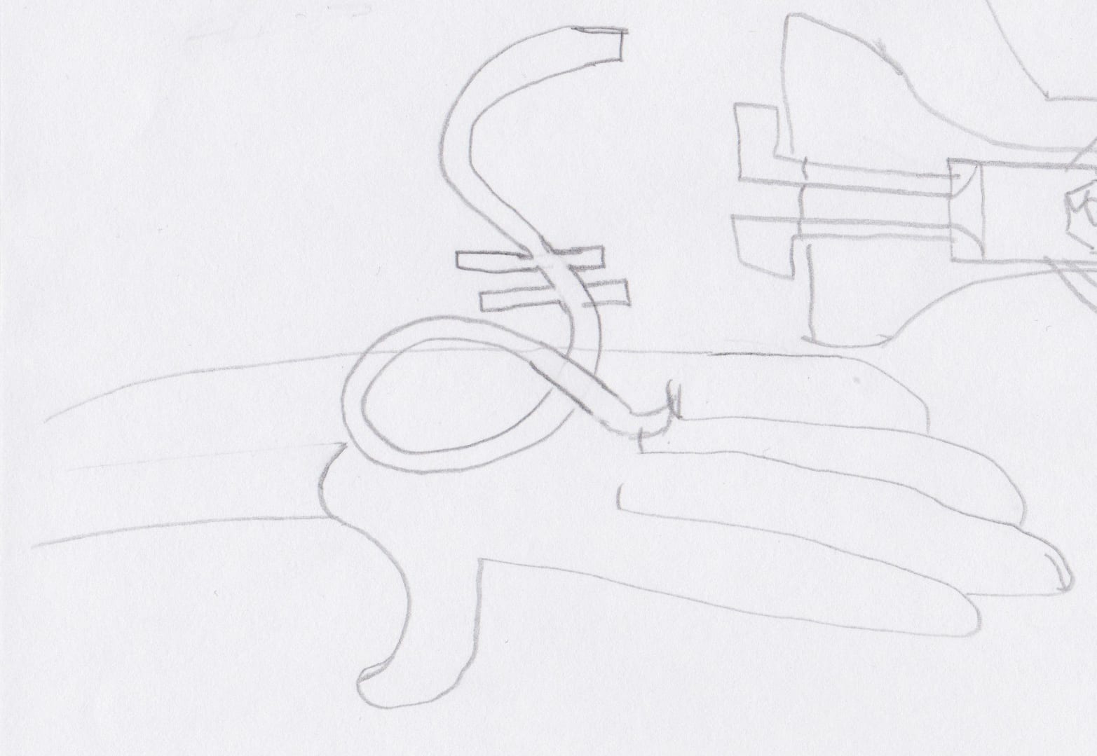
For my next logo I was trying to get back to the money side and make something catchy that would attract my demographic and get straight to the point so I then created Helping hand. Personally I really like helping hand as he is iconic and people can understand that he is something to do with money wise. In addition, he is called Helping Hand which gives the impression that he will help you with your money problems and I think he is best suited for my demographic.
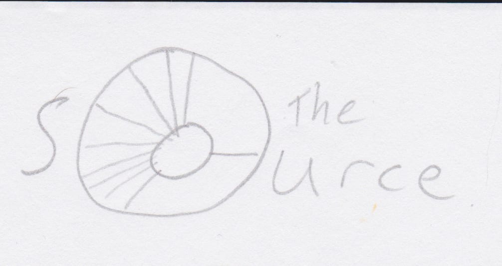
 

6 th design logo

6 th design logo

My final design took inspiration of google chromes wheel as it made me think of how could I turn that into something personal budgeting wise. It then occurred to me why not make it look like a pie chart which represents your personal budget where your most spending your money. I then felt I had to create a name for it and I came up with the name ‘The Source’. I thought of The Source as in ‘the source of your problems’. I again do feel like it would appeal to my demographic and that it looks professional but might get a bit mis interrupted into something else.

In conclusion, I am going to use helping hand logo as my user orientated design as I feel it is the best suited and will attract the right demographic to the personal budgeting app.

Standard

User Oriented Design – Research and Development

For my user oriented design I was given the subject area of personal budgeting.

When researching for personal budgeting I found a variety of websites and apps that already try and tackle this problem.

For instance, by simply typing into google ‘personal budgeting’ multiple websites appear that offer to help you to budget. Some websites are very basic, easy to manage and easy to access via computer, smartphone, internet and tablet. Other websites can be quite extensive and do like to go into detail, for example; how much money you have in your bank account, savers account, rent, utilities, transport, birthday and christmas expenses, food money etc. They also do offer access via apps with smartphones and tablets yet some websites offer software that you can download for a fee and use it as freely as you want.

online budgeting in its simple form.

online budgeting in its simple form.

online budgeting indetail

online budgeting indetail

online budgeting in detail

online budgeting in detail

However, all of them want you to do the hard work of invoicing what you have purchased and how much you spend in a day, weekly and monthly. They also want you to remember how much you spent but you could forget purchasing stuff or may be inaccurate on how much it cost, which isn’t going to make your budget accurate or know how much money you are able to spend or how much money you have saved.

I purpose that when you start your budgeting, if you have a bank card/ account, you link your account to your budgeting account that will then start giving you that most accurate budget. This can give the break down of when you were shopping. For instance, if you did your food shop at a supermarket it would record what you purchased and how much you spent in that food shop and may try give you advice on how to save 0n your next shop. Better yet, it could tell you where it would have been better to shop and could have saved you that little bit extra.

app of personal budgeting

app of personal budgeting

In addition if you withdraw money out of your account, the next time you go onto your budgeting website or app it would ask you what you did and/ or spend the money on.

There are already some apps that already try and attempt to do this, for example:

Easy Envelope budget aid app

Easy Envelope budget aid app


This is an app called ‘Easy Envelope Budget Aid’ I like the layout and gets straight to the point but it does look a bit dull and boring with the grey titles and plain background. However, I do like the feature that it has recorded what someone spend on their groceries which then shows you if you have not paid more or less on them then previously.

Screen Shot 2014-09-23 at 14.03.49

HomeBudget app


I like how the app shown above, called ‘HomeBudget’, has broken down everything that you have spent money on and on what day.Also how it has the relevant icons to go with the area, for example; a shopping trolly for groceries and a film reel for Netflix. However, I do not like how it looks like its been put on a note pad as I think it makes it look unprofessional and unreliable.


LearnVest app

LearnVest app

The LearnVest app looks like it has a lot of character and is the most interesting out of the lot. Once again this app breaks down how much money you have spent and by the looks of it they have broken it down into categories. The screenshot above shows how much someone has spent at each restaurant and bar they have been to in that month. It also shows you the percentage of money overall you have spent on restaurants and bars out of your budget. The look and design of this app is very good, interesting and professional.

debt free app

debt free app

debt free interface (1)

debt free interface (1)

The Debt Free app is properly one of the most unprofessional personal budgeting apps I have seen since my research. The reason why I am not a fan of this is that the logo for debt free is the word debt in a no entry sign which makes it look unprofessional and very unimaginative for a logo. In addition, the interface of the app looks unprofessional with the background of that blue. The break down of your accounts are just thrown together and the font used looks like times new roman which I am not a big fan of as its the default setting on software and hate seeing it.


In conclusion the demographic of people who are interested in personal budgeting are people who are aged between 18 – 45 year olds. The reason for this, depending on which range of the demographic you target towards, is how easy you want the interface to be. For instance, students aged 18 – 21 will want a very basic and easy to use and manage while older people might prefer a much more detailed budget for themselves but doesn’t mean that students might not want to use a more detailed budgeting software and vise-versa with older demograph.  I will attempt to create my own app for personal budgeting with its own logo and interface that looks professional easy to use and can be accessed on smartphones and computers that caters for both demographs.

Standard