
This is my logo for my app –
helping hand logo
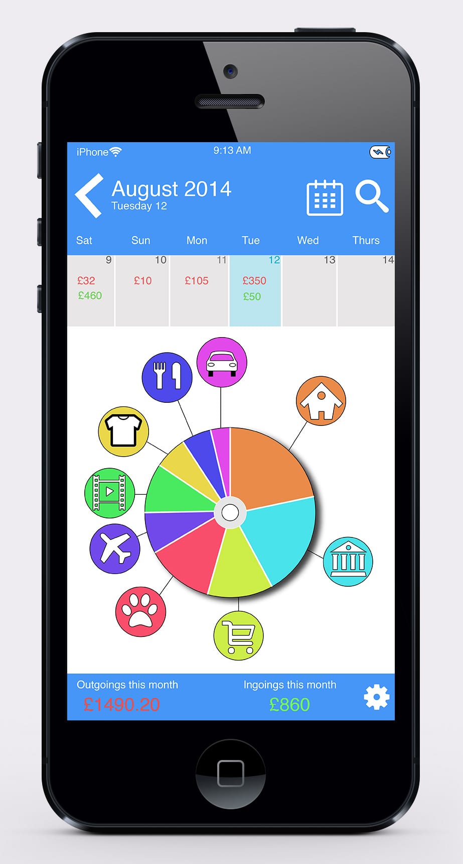
After much time creating and changing a few ideas from my design idea templates, I finally created my interface design.
iphone interface mock up
Looking back at my original design idea templates, I think I have combined the best bits of each design and added one or two things that I thought would be really good and appropriate for the device to have. For instance :
- Having a calendar so you can back track on your in and outgoings.
- A search button so if you purchased something specific it would search though all your invoices and bring up what it could be and at what date you purchased that item or saved in that month
- Also a small mini calendar as a scroll bar and can tell you how much have you spent and saved each day.
- A bottom bar that tells you how much you have spent and saved over a period of time e.g. week or monthly.
The interactive pie chart is the main attraction and I wanted that to stay along with it as with my first interface design I kept the interactive pie chart and stuck with the style of it. I have kept the saving and the outgoings from that design but instead of it being a bar it is now just at the bottom of the phone simply telling you what have you saved and how much you have spent.
The style of the app I wanted is it to be basic and easy to understand, not too complicated nor too basic that it wouldn’t do the needs of the demographic I am targeting.
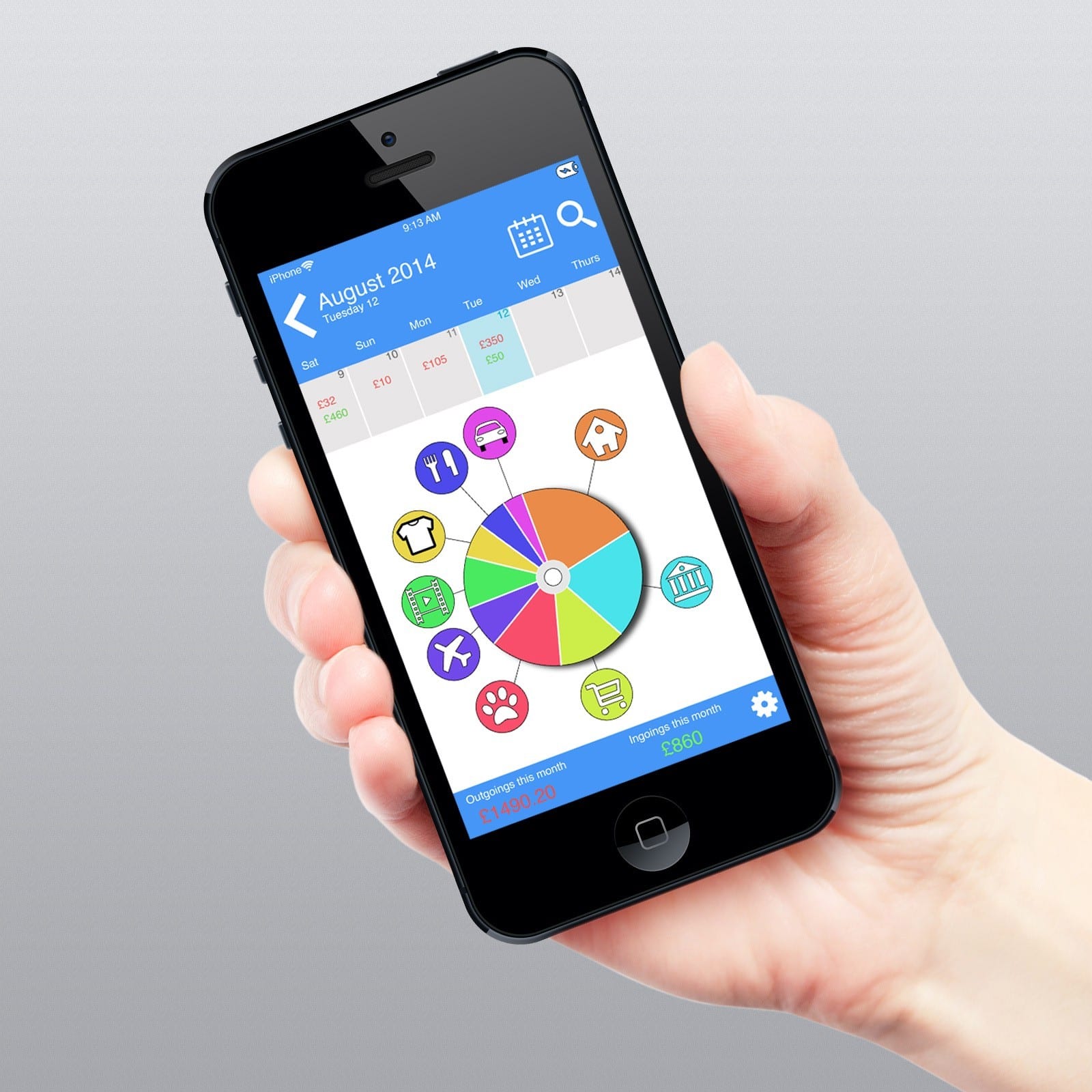
iPhone interface mock up hand
The interactive pie chart I feel speaks itself and tell you easily just from looking at it where the majority of your money is going and can see where you need to cut down on plus if you wanted a more detailed view of your accounts you just press the icon and it would open up for you and give you the break down of everything you wanted.
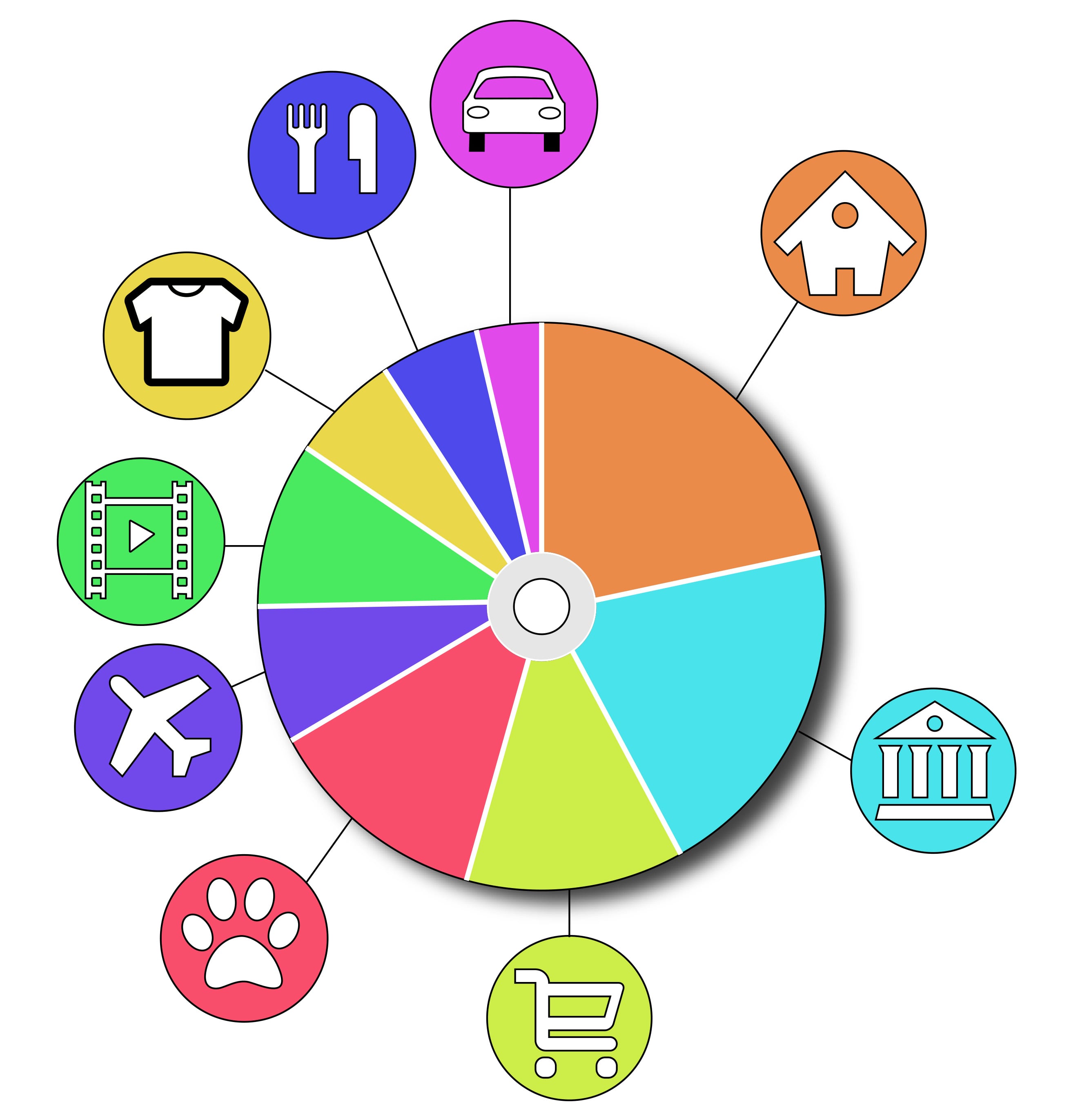
interactive pie chart
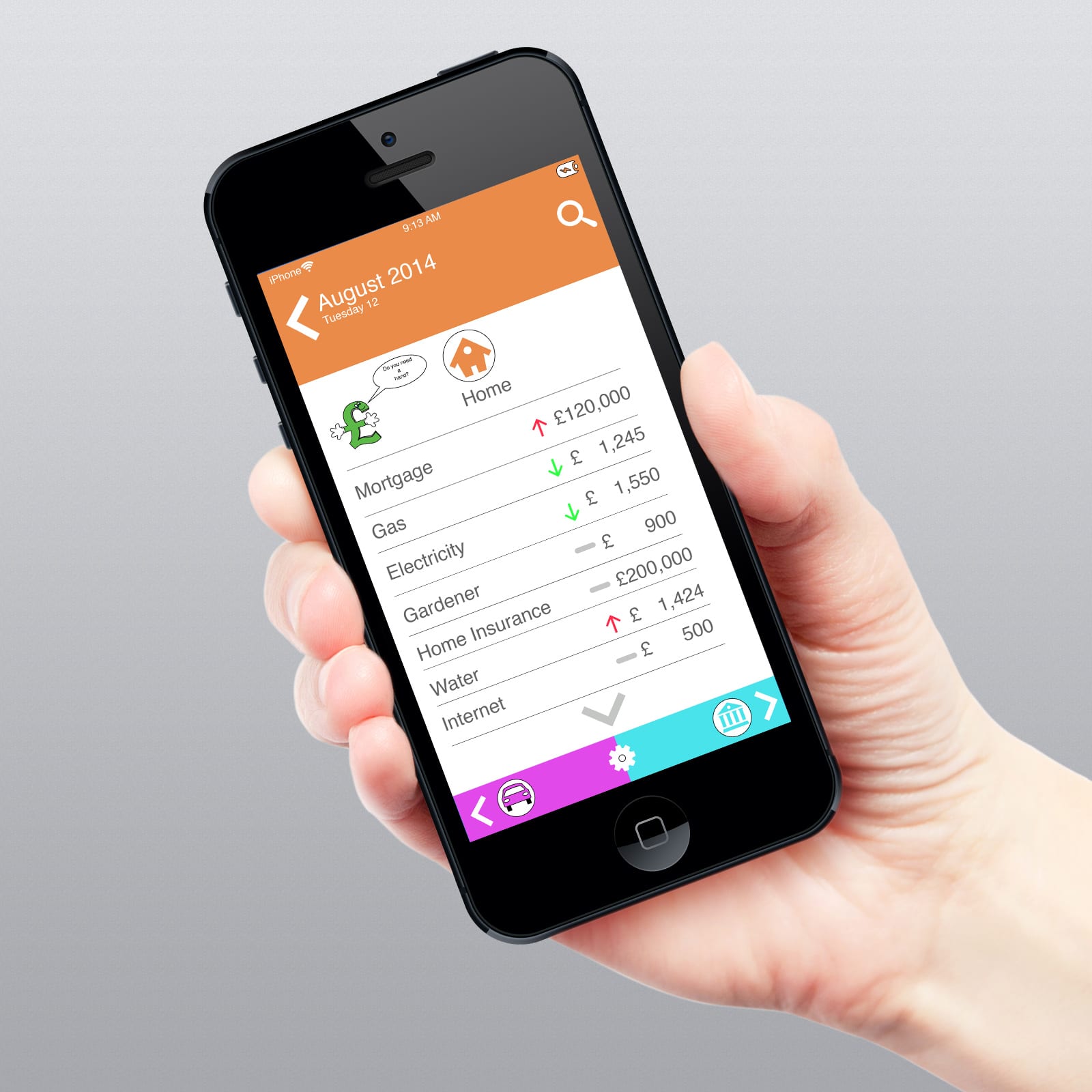
For example, if you press the House section (orange) it will then lead you to this screen.
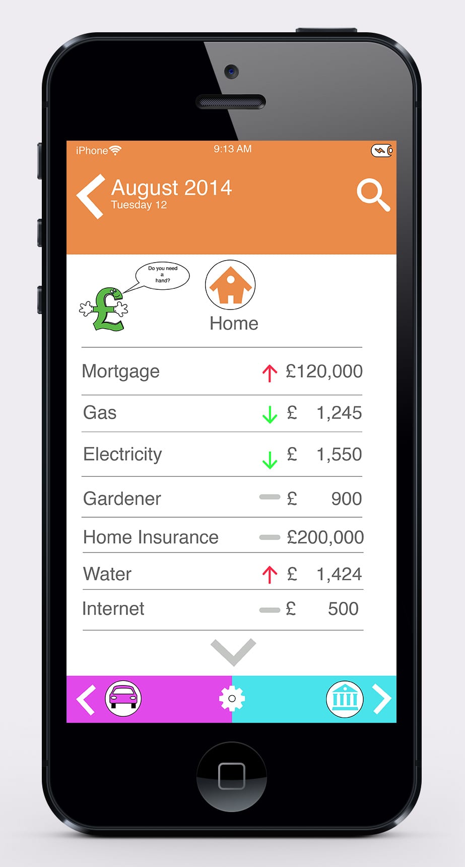
iphone interface in depth mock up
- In the screen above, it gives you the break down of everything you have spent in this topic/ area and shows it either weekly/monthly. It will then tell you if you spent less or more or it has stayed the same with the different coloured arrows; red is bad, green is good and the grey bar means no change.
- As you can see Helping Hand is on the left hand side asking “Do you need a hand?” Helping Hand will then try and give you advice and tips on how you can save more money in the topic/area you are in.
- You can also scroll down the menu screen to view more of what you have spend.
- Finally on the bottom, you have arrow keys that will go to the next topic/area that you are spending or saving money in.
In my designs I did try to incorporate both designs in as I liked some features from both. I dropped the features that I did not like and then thought when creating it that certain feature would be useful in this app. For example; the arrow keys that would take you to the next topic/area.
iPhone interface in depth mock up hand holding
Overall, I am really pleased on how this interface has turned out with its style, appearance and how detailed it is. I am really proud of creating this app and only wish I could make it for real to see if it would work in real life.