Digital Publication – Research

Digital publication is about magazines and books that have been put onto smartphones and tablets and can be accessed anywhere. In our Digital Media we are more specifically looking into how magazine’s are transformed into digital versions.

The earliest version of digital magazines were on computers which would simply just turn the page and could link you to there website.  They were usually free.

But now as they can be put onto smartphones and tablets, they have started to make them much more animated. For example; the National Geographic magazine, that me and my group looked at, showed the magazine with a black cover that was shrouded in fog and when the fog lifted it unveiled a dinosaur on the front cover.


National Geographic front cover Oct 2014

National Geographic front cover Oct 2014

Throughout the magazine, if you swiped it across, it would go to the next article but if you scrolled down the magazine it would go into more detail of the article and would be a more interactive to you.

Another digital magazine we looked into was WIRED Magazine. This digital magazine was much more interactive. When you look at the front cover the man at the front looks at you but when the sticky notes go on him, he starts to pull different faces.

WIRED Magazine oct 2014

WIRED Magazine oct 2014

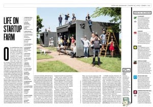
It does not stop there, when you start to go through the different articles it can allows you to be interactive with little the image and buttons there are. For example; in the article (below) the image is completely interactive everyone in that image has a number on there head, if you press on that it expands and tells you more about that person and there experience when doing the article. In addition, the apps of the month on the right hand side are completely interactive. If you press the app picture it will take you to the app store and show you that app which you can then purchase. Then, the digital magazine would sometimes play a video or an advertisement or something that WIRED had created.

Inside WIRED Magazine (1)

Inside WIRED Magazine (1)

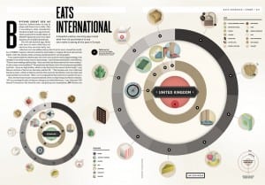
Inside WIRED Magazine (2)

Inside WIRED Magazine (2)

In the second magazine article (above) all the little icons were interactive. When you clicked the icon it would expand telling you more about it and again would lead to a link to another website or a video.

I found digital magazines very intriguing as I have never really looked into them before but I can see why they are quite popular as they are stored on your device. This means less luggage and they are also interactive, which would keep your readers entertained and intrigued in the magazine.


Standard

User Oriented Design – interface design

This is my logo for my app –


helping hand logo

helping hand logo


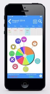
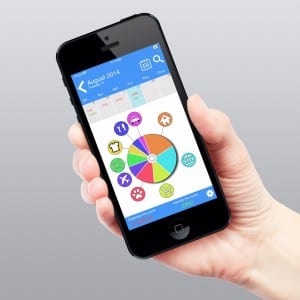
After much time creating and changing a few ideas from my design idea templates, I finally created my interface design.


iphone interface mock up

iphone interface mock up


Looking back at my original design idea templates, I think I have combined the best bits of each design and added one or two things that I thought would be really good and appropriate for the device to have. For instance :

  • Having a calendar so you can back track on your in and outgoings.
  • A search button so if you purchased something specific it would search though all your invoices and bring up what it could be and at what date you purchased that item or saved in that month
  • Also a small mini calendar as a scroll bar and can tell you how much have you spent and saved each day.
  • A bottom bar that tells you how much you have spent and saved over a period of time e.g. week or monthly.

The interactive pie chart is the main attraction and I wanted that to stay along with it as with my first interface design I kept the interactive pie chart and stuck with the style of it. I have kept the saving and the outgoings from that design but instead of it being a bar it is now just at the bottom of the phone simply telling you what have you saved and how much you have spent.

The style of the app I wanted is it to be basic and easy to understand, not too complicated nor too basic that it wouldn’t do the needs of the demographic I am targeting.

iPhone interface mock up hand

iPhone interface mock up hand


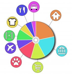
The interactive pie chart I feel speaks itself and tell you easily just from looking at it where the majority of your money is going and can see where you need to cut down on plus if you wanted a more detailed view of your accounts you just press the icon and it would open up for you and give you the break down of everything you wanted.

interactive pie chart

interactive pie chart

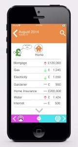
For example, if you press the House section (orange) it will then lead you to this screen.


iphone interface in depth mock up

iphone interface in depth mock up

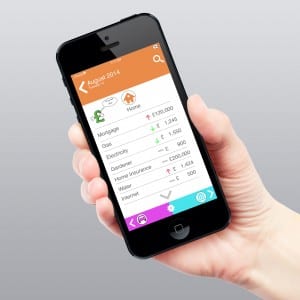
  • In the screen above, it gives you the break down of everything you have spent in this topic/ area and shows it either weekly/monthly. It will then tell you if you spent less or more or it has stayed the same with the different coloured arrows; red is bad, green is good and the grey bar means no change.
  • As you can see Helping Hand is on the left hand side asking “Do you need a hand?” Helping Hand will then try and give you advice and tips on how you can save more money in the topic/area you are in.
  • You can also scroll down the menu screen to view more of what you have spend.
  • Finally on the bottom, you have arrow keys that will go to the next topic/area that you are spending or saving money in.

In my designs I did try to incorporate both designs in as I liked some features from both. I dropped the features that I did not like and then thought when creating it that certain feature would be useful in this app. For example; the arrow keys that would take you to the next topic/area.


iPhone interface in depth mock up hand holding

iPhone interface in depth mock up hand holding

Overall, I am really pleased on how this interface has turned out with its style, appearance and how detailed it is. I am really proud of creating this app and only wish I could make it for real to see if it would work in real life.

Standard

User Oriented Design – Developing Interface

After choosing what logo I want to use and what demographic I am targeting, I decided it was time to create the interface for my app. Knowing the my demographic I am targeting, I wanted the interface for my app to be easy to use, could be understood from a glance and wouldn’t need in depth tutorial that could be complicated.


Interface idea 1

interface idea 1

interface idea 1

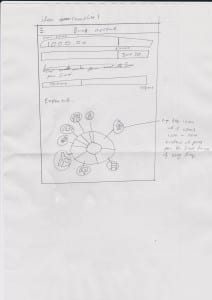
The idea of this interface was that it would tell you that the beginning how much you have in your account at the moment and the bar underneath would tell you how much you have spent in a month or week. The bar underneath that would tell you how much you have saved so far. The pie looking chart at the bottom would give you the break down of everything that you are spending on and its categorised in each section. If you wanted a more in depth review or think you have spent more on the food shopping section, you would tap the icon and would then expand and give you the break down of everything you have spent that week or month.

I really do like the pie looking chart and I personally feel that when my targeted demographic see it they would naturally would want to tap the icon to see more. I do like the bars at the beginning but do feel that it does clutter the place up a bit and would be more tidier if it had its own section in the interactive pie chart.


Interface idea 2 

interface idea 2

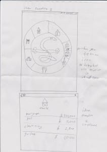
With my second design I continued the idea of the interactive pie looking chart but instead I incorporated my logo in the middle. The Helping Hand logo would point to what icon you tapped and again it would expand and give you a more in-depth review of that section, breaking it down into everything that you have spent in that category so that you could see where your money is going out. This could hopefully help you see where you are spending your money.

I personally like the idea that helping hand would be in the middle of the interactive pie chart  and point to the different categories that you have selected. I do feel that the younger demographic would really like that and wouldn’t bother them that much if helping hand did that. However, the older demographic might find this unprofessional and almost childish and would not want to use the app. In addition I do like how I have designed the break down of the selection that you select as it is plain, easy and helpful.


Interface idea 3     

interface idea 3

interface idea 3

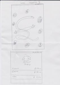
My third design considered of not using the interactive pie chart and instead would have the categories in bubbles floating around Helping Hand and again once you press the bubble Helping Hand would point to it and it would expand giving you the break down of that selection giving you an in depth review of that category.

With my third interface design I’m not convinced that it would work as well as the two designs that I have created as I do not think the bubbles work as well as the interactive pie chart. This is because with the interactive pie chart you could easily see where your money was going into and into what categories.


Conclusion

Overall  I am pleased with my interfaces i have designed as they all have pros and cons to each one so far I really like interface design one and two but i do feel like i need to incorporate both design ideas and change a few thing for instance i like in design 2 you just have the interactive pie chart straight away and you see it straight away but instead of helping hand in the middle and the icons inside the pie chart they should be like design one where the icons have there own bubble pointing to what section they are instead of design 2 where if you had small sections then you would not be abel to see the icon

The in depth menu screen of a section should stay the same, like in design two. However I do feel like I could incorporate Helping Hand in there as a little advice money guru to give ideas to people on how to save there money. This is almost like the paper clip in Microsoft word that would help people if you needed help with stuff.

Microsoft paperclip

Microsoft paperclip

Standard