After choosing what logo I want to use and what demographic I am targeting, I decided it was time to create the interface for my app. Knowing the my demographic I am targeting, I wanted the interface for my app to be easy to use, could be understood from a glance and wouldn’t need in depth tutorial that could be complicated.
Interface idea 1
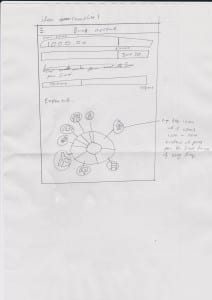
The idea of this interface was that it would tell you that the beginning how much you have in your account at the moment and the bar underneath would tell you how much you have spent in a month or week. The bar underneath that would tell you how much you have saved so far. The pie looking chart at the bottom would give you the break down of everything that you are spending on and its categorised in each section. If you wanted a more in depth review or think you have spent more on the food shopping section, you would tap the icon and would then expand and give you the break down of everything you have spent that week or month.
I really do like the pie looking chart and I personally feel that when my targeted demographic see it they would naturally would want to tap the icon to see more. I do like the bars at the beginning but do feel that it does clutter the place up a bit and would be more tidier if it had its own section in the interactive pie chart.
Interface idea 2
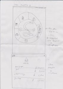
With my second design I continued the idea of the interactive pie looking chart but instead I incorporated my logo in the middle. The Helping Hand logo would point to what icon you tapped and again it would expand and give you a more in-depth review of that section, breaking it down into everything that you have spent in that category so that you could see where your money is going out. This could hopefully help you see where you are spending your money.
I personally like the idea that helping hand would be in the middle of the interactive pie chart and point to the different categories that you have selected. I do feel that the younger demographic would really like that and wouldn’t bother them that much if helping hand did that. However, the older demographic might find this unprofessional and almost childish and would not want to use the app. In addition I do like how I have designed the break down of the selection that you select as it is plain, easy and helpful.
Interface idea 3
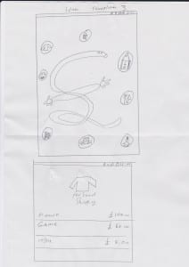
My third design considered of not using the interactive pie chart and instead would have the categories in bubbles floating around Helping Hand and again once you press the bubble Helping Hand would point to it and it would expand giving you the break down of that selection giving you an in depth review of that category.
With my third interface design I’m not convinced that it would work as well as the two designs that I have created as I do not think the bubbles work as well as the interactive pie chart. This is because with the interactive pie chart you could easily see where your money was going into and into what categories.
Conclusion
Overall I am pleased with my interfaces i have designed as they all have pros and cons to each one so far I really like interface design one and two but i do feel like i need to incorporate both design ideas and change a few thing for instance i like in design 2 you just have the interactive pie chart straight away and you see it straight away but instead of helping hand in the middle and the icons inside the pie chart they should be like design one where the icons have there own bubble pointing to what section they are instead of design 2 where if you had small sections then you would not be abel to see the icon
The in depth menu screen of a section should stay the same, like in design two. However I do feel like I could incorporate Helping Hand in there as a little advice money guru to give ideas to people on how to save there money. This is almost like the paper clip in Microsoft word that would help people if you needed help with stuff.


